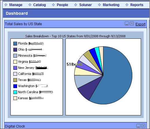
Add a Top X Sales by State pie chart to your Dashboard
Introduction
The attached files will give you a new spiffy pie chart on your Admin-side dashboard. The cool part is the pie chart shows you the Top x States in Total Sales. Plus, you can configure whether the chart will total YTD or MTD sales in your store. Keep in mind that configuring for YTD will hit your SQL database a lot harder than the MTD. I haven't incorporated any caching, so I would suggest using YTD only if your sales volume is less than 100 orders a month. Feel free to test your own mileage though, might be nice and fast for you.
Installation
Download this attached zip file to your hard drive:
http://forums.ablecommerce.com/download/file.php?id=220
Unzip the file into a folder. Put the .ASCX and .ASCX.VB files in your ~/Admin/Dashboard/ folder on your store website. Keep the .Webpart file on your local drive - you're going to upload that in the next step.
Adding to our Dashboard
Installing the new control into your dashboard is really quite slick. Most people don't realize you can customize your Admin dashboard. Log into your site now and get to the Admin Dashboard. In the upper-right side is a "Customize" link - click it. Nothing seems different until you scroll all the way to the bottom and you'll see a new little Edit Window.
Change the dropdown to Edit Layout if it's not already set. In the little Catalog Zone section, click the (rather tiny) link labelled "Your Controls". An upload box will appear - click the Browse button and select that .Webpart file you kept on your local drive from the download zip. Once the filename is populated, click the "Upload" button. Now the screen shows you one (again tiny font) checkbox choice "Total Sales by US State". Click the checkbox to select it and set the Add to Zone dropdown to Zone 1 or Zone 2. Basically Zone 1 is the left half of the dashboard and Zone 2 is the right half. Which ever one you choose, the new chart will appear at the top of the zone. Don't worry, you can change that later. Pick a zone and click "Add". Voila! You know have a nifty little pie chart on your Dashboard.
Configuration
You can also configure several of the various controls on the dashboard. For our pie chart, let's change the number of states to display. Click the "Customize" link at the top again, and this time change the Edit dropdown near the bottom to "Edit Contents". This will give each section a new little "pencil" icon in each section title bar. Hover on that icon in the title bar of our new pie chart and you'll see it say "edit this part". Click it. Nothing will seem to have happened unless you scroll all the way to bottom. Now you can see two parameters available for this particular control. MaxStates controls the number of states to display in the control, the default is 10. YTD forces the control to accumulate Year-to-Date figures instead of Month-to-Date. Adjust the MaxStates to a new value, click OK and then click the big Dashboard icon in the page header to refresh the whole enchilada.
Conclusion
A nifty little addition to an already great storefront product. This pie chart will give you a new insight into the sales history of your online business. Now you can start those targeted Google Ads you've been meaning to do all summer long. For those interested a more customized version of the dashboard control or even new charts altogether, feel free to drop me a note at http://www.AbleMods.com and I'll be happy to discuss your needs.
Screen Shot
Reference
Originally posted in forums by Joe Payne http://forums.ablecommerce.com/viewtopic.php?f=47&t=8210
